|
|
|
| P R I N T E R - F R I E N D L Y F O R M A T | Return to Article |
D-Lib Magazine
July/August 2012
Volume 18, Number 7/8
Visual Search for Supporting Content Exploration in Large Document Collections
Drahomira Herrmannova and Petr Knoth
KMi, The Open University
{drahomira.herrmannova, p.knoth}@open.ac.uk
doi:10.1045/july2012-herrmannova
Abstract
In recent years a number of new approaches for visualising and browsing document collections have been developed. These approaches try to address the problems associated with the growing amounts of content available and the changing patterns in the way people interact with information. Users now demand better support for exploring document collections to discover connections, compare and contrast information. Although visual search interfaces have the potential to improve the user experience in exploring document collections compared to textual search interfaces, they have not yet become as popular among users. The reasons for this range from the design of such visual interfaces to the way these interfaces are implemented and used. In this paper we study these reasons and determine the factors that contribute to an improved visual browsing experience. Consequently, by taking these factors into account, we propose a novel visual search interface that improves exploratory search and the discovery of document relations. We explain what our universal approach is, and how it could be applied to any document collection, such as news articles, cultural heritage artifacts or research papers.
Keywords: Information Visualisation, Content Exploration, Exploratory Search
1. Introduction
Search has been for a long time an integral part of many applications and systems. Nowadays, it has become a daily activity for almost everyone and it is a common way of accessing data and information. Search can be often a complex and a time-consuming task [Marchionini, 2006]. Among the main reasons are information overload and the so-called "lost in hyperspace" problem. Information overload comes with the incredible (and growing) speed with which content is generated. This term addresses the fact that with the growing amount of content it becomes harder (or even impossible) to comprehend it. "Lost in hyperspace" refers to the problem of navigating in large quantities of virtual (typically hypertext) content. While following links and relationships, people might easily lose track of how they got to their current "position."
Over the last 20 years, search has become an essential activity of our lives and the way people search and what they require from search interfaces has changed. Gary Marchionini [Marchionini, 2006] divides search tasks in two basic types — lookup search tasks and exploratory search tasks. The names of these two concepts already suggest how search has evolved from single-step "fact retrieval" or "question answering" to complex activity that incorporates analysing, comparing and evaluating the content.
While exploratory searches constitute a significant proportion of all searches [Rose and Levinson, 2004], current search interfaces do not sufficiently support them. This issue has been addressed by a number of researchers by exploring the use of information visualisation. Visual search interfaces make use of our visual skills in order to help us to navigate through content. An important aspect of visualisations is that they make it easier to communicate structure, organisation and relations in content. They can also be well utilised to improve search experience, by depicting more information than a typical text search interface using the same space, and they can simplify the process of finding relevant information and can provide graphical aid in results diversification.
In this paper we study the use of visual interfaces to aid exploratory search in document collections. Document collection visualisations typically project content along one or more selected dimensions — this might be time or other properties of documents in the collection. In contrast, we address this problem by exploring generally applicable principles without considering a specific document collection. With these principles in mind, we design a novel visual interface that can work with any type of dimension and any number of dimensions and demonstrate its usability on the domain of research publications.
The remainder of this paper is organised as follows. Section 2 reviews the current work in the field of visualising document collections. Section 3 analyses the design principles that constitute a good practise in the design of visual interfaces. The design of our visual interface is then presented in Section 4. Finally, the contribution of the approach is discussed and the future work is outlined.
2. Related Work
Current approaches to visualising document collections can be divided according to the granularity of information they provide about the collection into the following groups:
- Collection level — visualise attributes of the collection. These visualisations typically aim at providing a general overview of the collection content.
- Document level — visualise attributes of the collection items, their mutual links and relations.
- Intra-document level — visualise the internal structure of a document, such as the distribution of topics within the document.
In this paper, we are concerned with document level visualisations, however certain concepts from collection level are also applicable.
A well-known example of the first (collection level based) type of visualisations are tag clouds [Hassan-Montero and Herrero-Solana, 2006] that visually (using attributes like font size and colour) communicate statistical information (such as word, tag or topic frequency) about the collection. A considerable number of these visualisations focus on depicting topics or themes contained in the collection. While the ThemeRiver [Havre et al., 2002] and the TIARA [Wei et al., 2010] (Figure 1) visualisations both show changes of themes in the collection over time, [Chaney and Blei, 2012] use visualisation to reveal theme structure of a collection (for example, an overview of Wikipedia topics from their visualisation can be seen in Figure 3). The FacetAtlas project [Cao et al., 2010] (Figure 2) focuses on multi-faceted documents and keywords, and combines search with a visualisation depicting the keyword senses and different relations between documents based on these senses. Collection level visualisations can also be used for visualising document clusters in a collection. Galaxies [Wise et al., 1999] or InfoSky [Granitzer et al., 2004] (Figure 4) are good examples of document cluster visualisations.
Visualisations focused on collection level information are well suited for analytical and statistical tasks. They can help in the exploration of the collection by providing an overview of the collection content, like in the FacetAtlas [Cao et al., 2010] (Figure 2) or in the TIARA [Wei et al., 2010] (Figure 1). In this case, the exploration happens at the collection level which provides the user with a general overview of the collection's characteristics.
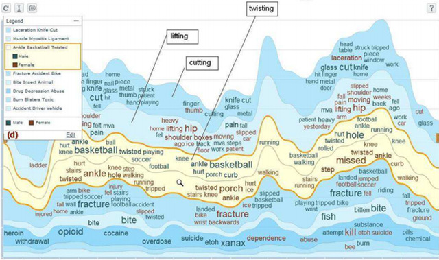
Figure 1: TIARA visualisation showing visualisation of a field "cause of injury"
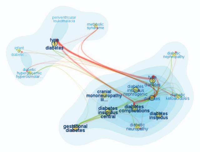
Figure 2: FacetAtlas visualisation showing visualisation of a query word "diabetes"
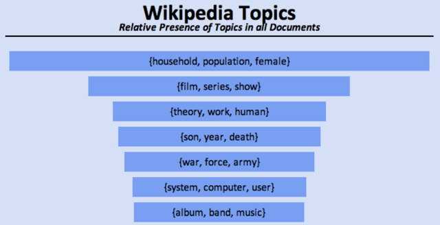
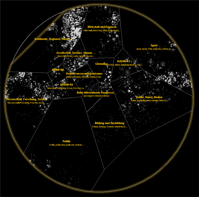
Figure 4: InfoSky visualisation
The second group of visualisations focuses on visualising document level properties. In this paper, we are interested mainly in their use to aid information discovery and content exploration. Regarding this area, a growing number of researchers have been interested in various collections and networks which emerged on the Web in recent years, one such collection being Wikipedia. Data from Wikipedia are hierarchically organised and highly interlinked, which provides good foundation for visualisations. [Hirsch et al.,] created two visualisations, one of them built upon Freebase (a collection similar to Wikipedia) and the other upon Wikipedia (Figure 6). Both visualisations present the user with articles related to the currently browsed article and with types of connections between these articles. This way of visualising related articles helps users to quickly explore relevant topics (information about places, people, etc.). [Milne and Witten, 2011] (Figure 5) chose a slightly different approach. They utilised suggestion of related articles and their clustering to increase legibility of the visualisation. This is an important quality which can influence whether the user will use or abandon the visualisation. The Wivi visualisation (Figure 7) created by [Lehmann et al., 2010] uses a different approach for suggesting relevant articles. It builds a graph of already visited articles and suggests relevant unvisited articles based on relevance to all articles in the browsing history. Relevance of unvisited articles is indicated using a varying distance of articles in the visualisation. Suggestion of relevant items based on multiple interesting documents (instead of one) is a useful feature which might help to narrow the selection of relevant items. In our visual search interface, we utilise a similar approach. We give the user the possibility to choose and add to the visualisation any documents and any number of documents.
Visual search interfaces can also be divided according to the way the exploration is carried out. J. Zhang [Zhang, 2008] divides search tasks into the following two groups that are also applicable to visual search interfaces:
- Browsing-focused — The user starts exploration at a specific point in the collection (typically a root document or a topic; usually the same point is used every time) from which the user navigates through the collection.
- Query-focused — The user starts with a query, which determines the entry point from which the exploration starts.
As in textual search interfaces, one way to visually explore document collections is to start with an initial point and browse through the collection by navigating from this initial point. The starting point might be, for example, an overview of the whole collection like in [Chaney and Blei, 2012] (Figure 3) and [Granitzer et al., 2004] (Figure 4) or it might be a root element of a hierarchy as in the category view of the WikiVis visualisation described in [Biuk-Aghai, 2006]. In contrast to this way of exploring the collection, the query-based search interfaces start with the user specifying a query and building a visualisation based on one ([Hirsch et al.], Figure 6 and [Milne and Witten, 2011], Figure 5) or multiple ([Lehmann et al., 2010], Figure 7) documents from this result list.
Regarding the two previously mentioned divisions, we would describe our visualisation as document and query based. It aims to visualise articles, related to a user query and through showing relations between these articles to help users to decide how and where to focus his further search and exploration.
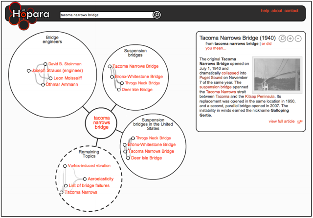
Figure 5: A Hopara visualisation showing topics and articles related to article about "Tacoma Narrows Bridge"
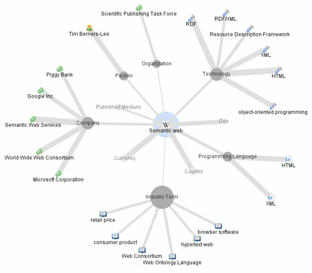
Figure 6: A ThinkPedia visualisation showing articles related to "Semantic Web"
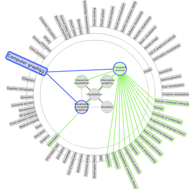
Figure 7: A Wivi visualisation
3. Design Principles of Visual Search Interfaces
In this section, we study general design principles for creating document visualisations, select those that are relevant for visual search interfaces and provide examples of their use.
An empirical study of 6 visual interfaces was carried out by [Chen and Yu, 2000]. They concluded that users typically perform better (in terms of efficiency and accuracy) with simpler visual interfaces, regardless of their cognitive abilities. A similar study was conducted by Sebrechts et al. [Sebrechts et al., 1999] who performed a comparative evaluation of textual, 2D and 3D versions of the NIRVE search interface. The study pointed out that visual interfaces, in contrast to classical textual interfaces, should simplify the process of accessing information. According to the authors, the usability of visual interfaces is dependent on three factors: the visual interface, the task being performed using this interface and the user performing the task. This means that visual interfaces might be better suited for some information seeking tasks than others (for example, visual search interfaces are probably better suited for exploratory tasks than for lookup tasks). Sebrechts et al. also observed several factors that affected the usability of the visual interfaces: the use of colours, number of documents in the visualisation, fixed spatial location of the visualisation and the difference between 2D and 3D interfaces. We have analysed these factors, discovered interesting examples of their use in the design of visual search interfaces and organised them into the following list of design principles.
- Added value1 with respect to a textual solution. Every visual interface should provide an advantage over a textual interface. The visual interface can assist in the discovery of different information that might otherwise be difficult to see, it might increase the speed of communicating the information, it might help to organise the information more clearly, etc. According to [Sebrechts et al.,1999] and [Baeza-Yates and Ribeiro-Neto, 1999] the visual interface should reduce the mental workload of the user. When document collection exploration is considered, relations between documents might be easier to comprehend when using visual representation rather than textual. FacetAltas [Cao et al., 2010] (Figure 2) is a good example of a visualisation which manages to graphically communicate relations (in this case relations and connections between items based on different facets) that would be difficult to present textually.
- Simplicity. One of the main reasons why textual interfaces are often preferred over visual interfaces is that they can be used with little previous knowledge. This is due to their simplicity and the fact that their design mostly follows standard patterns. Visual interfaces that are simple and do not require any learning curve have been found generally better than more complex ones [Chen and Yu, 2000]. We are not aware of any popular visual search interface that would be preferred over a textual one for its simplicity.
- Visual legibility strongly influences user experience with the search interface. Hardly readable text labels, overlapping items or too many items in the view may be a reason for the user to prefer a textual interface even if the visual interface conveys more information. For example, Hopara search interface [Milne and Witten, 2011] (Figure 5) accomplishes legibility by the use of document clustering and by suggestion of relevant topics.
- Use of colours is a simple but a very powerful tool. Colours can help to immediately identify a shared feature, the type of a relation, a membership in a group, etc. The study [Sebrechts et al., 1999] pointed out that colours helped to immediately identify groups of articles (regardless of the type or dimension of the interface). [Lehmann et al., 2010] (Figure 7) and [Cao et al., 2010] (Figure 2) show how colours can be used in visual search interfaces.
- Dimension of the visualisation projection. 3D interfaces might be useful and legible in some cases but inconvenient in other cases. A disadvantage of 3D interfaces is that not all parts of the visualisation might be visible in a single view (as in WikiVis visualisation presented in [Biuk-Aghai, 2006], Figure 8) — this reduces the legibility and makes the navigation more difficult.
- Fixed spatial location of the visualisation. Sebrechts et al. [Sebrechts et al.,1999] point out that once users started to rotate the 3D visual interface, they lost track of relations that were no longer visible. This might apply also to 2D interfaces which require zooming. As a result, it is important to consider the use of features, such as rotation and zooming, and what effect they have on navigation.
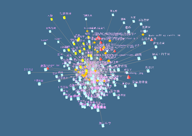
Figure 8: A WikiVis visualisation
4. The Approach
The main motivation of our research is to develop a visual interface that can provide better support for exploratory search than current textual interfaces and that is conceptually applicable in any document collection regardless of its type. The interface should also provide an added value by assisting in the discovery of interesting connections that would otherwise remain hidden.
4.1 The considered types of document collections
Every document in a collection is defined according to a set of dimensions (sometimes called facets). The dimensions are typically of different types. Each document can be described by a set of properties, each of which expresses the value of a corresponding dimension. Although the specific dimensions are dependent on the document collection domain, they are always present in a real-world document collection. For example, an article in a news collection can be described by the properties corresponding to dimensions, such as time, themes, locations, and relations to other articles. Documents describing cultural heritage artifacts can be characterised by artifact type, historical period, style, material, etc. Similarly, research articles can be represented by citations, authors, concepts, similarities with other research articles, etc. These properties are either explicit or implicit (similarity with other items). Explicit properties relate to user defined properties, typically citations, authors, location. Implicit properties refer to properties such as document similarity, which usually need to be discovered. Many visual interfaces are tailored to specific domains and their dimensions. In this paper, we consider all types of document collections. Since our interest lies in collections of scientific publications, we demonstrate our approach on this domain.
4.2 The objectives of our approach
Our visual search interface is based on the combination of the following principles which differentiate our approach from previous work:
- Support for comparing and contrasting content. The search interface should offer the means for comparing and contrasting properties of multiple documents.
- Support for exploration across dimensions. The search interface should help assist in the discovery of interesting relationships across dimensions by taking into account multiple aspects simultaneously.
- Universal approach to the visualised dimensions. The visual search interface can be adapted to any document collections.
While the first two principles are difficult to realise in textual search interfaces, satisfying the third one is a challenge for visual interfaces. Our contribution is in addressing these principles at once.
4.3 The functionality
The proposed visual search interface consists of a visualisation area which is supported by a left and right sidebar. The left sidebar features a search box, which is the starting point of visual search, and an area for the search results. In the first step, the user will enter an initial query into the search box and a list of relevant documents will be displayed. The user can select one of the documents and see its details in the right sidebar. Any of these documents can be dragged into the visualisation area, which initialises the visualisation. The visualisation enables the user to perform the following activities: exploring document relations, discovering interesting connections across dimensions, comparing and contrasting documents.
4.3.1 Exploring document relations
The visualisation itself shows the selected document in the centre of the screen in an area we call the document stack. Any number of documents can be added to the document stack. This area is surrounded by a set of predefined dimensions that are suitable for the visualised document collection. Figure 9 shows the dimensions relevant to the domain of scientific articles. For this example, we chose document authors, concepts (the document topics or themes), similar documents and citations. In a typical collection, there will be many documents related to the content of the document stack and the user can scroll through them. Each of the dimensions offers a different view on the related documents. For example, the area showing document authors might reveal other documents from the same authors. Similarly, the concepts area enables the user to explore documents discussing the same topics. Some of the areas can be customised to further specify the relatedness criteria. This can be achieved by modifying the dimension settings that appear in the bottom right sidebar. For instance, the visualisation allows deselecting any of the concepts in the concepts view and consequently fine-tuning the list of the relevant documents. The document stack can also be minimised (using a small icon in its top left corner) to provide a clear view of all document connections.
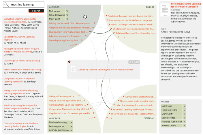
Figure 9: Preview of the visual search interface, showing one document in the document stack and its relations
4.3.2 Discovering interesting connections across dimensions
Just like the documents in the stack, the related documents are also described by the same set of properties — authors, concepts, similar documents and citations. These documents relate not only to the document stack, but also to one another, across the dimensions. For example, one of the cited documents can share an author with a document in the stack. The cited document will appear in two views — in the authors view and in the citations view. Our visualisation displays these connections using thin curved lines. If the same document appears in multiple views, it will be connected by a thicker connecting line.
Any of the related documents can be selected in order to reveal connections across dimensions (using a small reveal connections icon which appears after selecting the related document). This is used to highlight only the documents that relate to both the document stack and the selected document. As shown in Figure 10, the interface adjusts the content displayed and hides documents that are not related to the selected document.
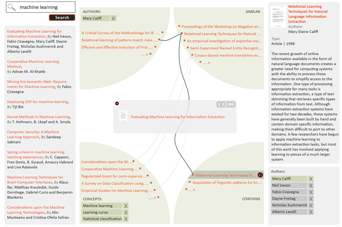
Figure 10: Discovering interesting connections across dimensions by selecting a relevant document
4.3.3 Comparing and contrasting documents in the document stack
At any time, the user can drag more documents displayed in the visualisation area or in the left sidebar to the document stack. This allows the comparing and contrasting of their properties and relations. The documents in the stack can share any properties. The user can switch between the union and intersection mode as shown in Figure 11 to see all the properties and relations of the documents in the stack or only the shared properties and relations. Visualised documents can be removed from the document stack.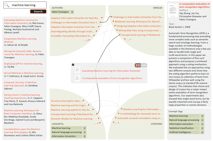
Figure 11: Comparing and contrasting documents
4.4 Applications in other domains
In the previous section, we have described the functionality of the visual search interface and demonstrated how it can be applied in the domain of research papers. The functionality and the interface design are universal and can be used in any document collection. For example, we could apply the interface on a collection of news articles. The dimensions in this case might be time, location, topic, author, links to other news articles, etc. Even though we demonstrated the use of the interface on a domain with four dimensions, the principles and the functionality are the same. The only difference is in the number of dimensions. The maximum number of dimensions is in theory not restricted, the only restrictions being the size and resolution of the screen and the limitations of human perception. If more views than can fit on the screen need to be visualised, the interface should allow the user to select the desired combination, but should not allow visualising more than the maximum number to keep the interface simple and legible.
Another example of using the visual search interface would be its application in the domain of cultural heritage artifacts. In this case, we can recognise the following dimensions — artifact type, location, historical period, style and significant people related to the artifact (creator, owner, etc.). The visual interface could be used, for example, to discover interesting connections between the location of an artifact and a significant person.
5. Future Work
Our next step is to perform a user study to evaluate the usability of the presented visual search interface, its adherence to the identified design principles and its advantages and disadvantages. The results of the user study should help us to fine-tune the approach. We also plan to integrate this visualisation with the CORE system 2, which aggregates research papers from many Open Access repositories.
Finally, we would like to provide the technical support for reusing the visual search interface in other domains by the means of an API. This API would make it possible to use this search interface in different types of document collections. The user would provide a definition of dimensions (a description of the types of information shown in each dimension) and a function (search engine) for each dimension that would return an ordered list of relevant results for a selected document or documents. The API would then accept metadata of documents in the collection and would build a visualisation on top of this metadata.
6. Discussion
In Section 2, we divided document collection visualisations according to the granularity of information they provide about the collection. In the field of visualising research papers, a number of tools for creating collection overviews have been developed. These include the ASE [Gove et al., 2011] and NVSS [Shneiderman and Aris, 2006] tools, which use citation networks, and the GRIDL [Shneiderman et al., 2000] tool, which creates a visual overview of digital library search results. While these tools can be classified as collection level visualisations, we provide a document level visualisation. Document level visualisations, such as [van Ham and Perer, 2009] and [Chau et al., 2011], usually provide a visualisation of the local subgraph surrounding a specified document. In contrast, our tool provides a view on multiple dimensions of a specified document (or a set of documents) and relations between these dimensions. Another difference is that the designed visual search interface allows search results in these dimensions to be ranked, ordered according to their relevance and paginated, preserving a key feature of traditional search interfaces. This feature is difficult to provide in visualisations of the local subgraph surrounding a specified document and we are not aware of any such interface that would support it.
In the design of the presented visual search interface, we aimed at addressing some of the main issues of current search interfaces. The presented interface addresses the two problems mentioned in the introduction: information overload and "lost in hyperspace." The interface mitigates information overload in two ways. It (a) helps users to identify different types of connections between documents and (b) it also helps to explain their meaning. We believe this makes it easier for users to find important information and comprehend it. It also prevents users from "getting lost" in the document space by allowing them to add new documents into the stack without needing to leave the current position.
The connections in our visual interface correspond to correlations between dimensions. Current search engines typically evaluate the relevance of a user query with respect to all these dimensions at once, which might make it more difficult for the user to discover these correlations. While this behaviour of search engines is often desirable (as it hides complexity), we believe it is not always the case when exploratory search is needed. For example, in the domain of research publications, if there is a large number of connections between similar documents and citations (relevant to the documents in the stack) indicating a strong correlation between these two dimensions, it probably means that the citations used in the research papers cover the visualised domain well. If this correlation appears between authors and citations, but does not appear between other dimensions, it might indicate that authors do not refer to similar work but rather cite their own papers. These correlations are difficult to spot when using traditional search engines.
7. Conclusion
This paper studied how visual search interfaces can be used to support exploratory search in large document collections. We analysed common design principles of document visualisations and, based on these principles, designed a novel document level query-focused visual search interface. We demonstrated by example how this interface can be applied to explore collections of research papers and discussed the applicability of this approach in different domains. The contribution our approach makes is in the combination of the following aspects: support for comparing and contrasting content, support for the discovery and exploration of content across dimensions, and adaptability of the visual interface to different domains.
Notes
1Added value stays at a different level of abstraction than the remaining design principles. It refers more to the overall concept of the visual interface rather than how the visual interface is presented.
References
[1] Ricardo A. Baeza-Yates and Berthier Ribeiro-Neto. 1999. Modern Information Retrieval. Addison-Wesley Longman Publishing Co., Inc., Boston, MA, USA.
[2] Robert P. Biuk-Aghai. 2006. Visualizing co-authorship networks in online wikipedia. In Communications and Information Technologies, 2006. ISCIT '06. International Symposium on, pages 737—742. September.
[3] Nan Cao, Jimeng Sun, Yu-Ru Lin, David Gotz, Shixia Liu, and Huamin Qu. 2010. Facetatlas: Multifaceted visualization for rich text corpora. IEEE Transactions on Visualization and Computer Graphics, 16(6):1172—1181, November. http://dx.doi.org/10.1109/TVCG.2010.154
[4] Allison J. B. Chaney and David M. Blei. 2012. Visualizing topic models. Department of Computer Science, Princeton University, Princeton, NJ, USA.
[5] Duen Horng Chau, Aniket Kittur, Jason I. Hong, and Christos Faloutsos. 2011. Apolo: making sense of large network data by combining rich user interaction and machine learning. In Proceedings of the 2011 annual conference on human factors in computing systems, CHI '11, pages 167—176, New York, NY, USA. ACM. http://dx.doi.org/10.1145/1978942.1978967
[6] Chaomei Chen and Yue Yu. 2000. Empirical studies of information visualization: a meta-analysis. International Journal of Human-Computer Studies, 53(5):851—866, November. http://dx.doi.org/10.1006/ijhc.2000.0422
[7] R. Gove, C. Dunne, B. Shneiderman, J. Klavans, and B. Dorr. 2011. Evaluating visual and statistical exploration of scientific literature networks. In Visual Languages and Human-Centric Computing (VL/HCC), 2011 IEEE Symposium on, pages 217—224, September. http://dx.doi.org/10.1109/VLHCC.2011.6070403
[8] Michael Granitzer, Wolfgang Kienreich, Vedran Sabol, Keith Andrews, and Werner Klieber. 2004. Evaluating a system for interactive exploration of large, hierarchically structured document repositories. In Proceedings of the IEEE Symposium on Information Visualization, INFOVIS '04, pages 127—134, Washington, DC, USA. IEEE Computer Society. http://dx.doi.org/10.1109/INFOVIS.2004.19
[9] Yusef Hassan-Montero and Victor Herrero-Solana. 2006. Improving tag-clouds as visual information retrieval interfaces. In Merida, InScit2006 Conference.2006, October.
[10] Susan Havre, Elizabeth Hetzler, Paul Whitney, and Lucy Nowell. 2002. Themeriver: Visualizing thematic changes in large document collections. IEEE Transactions on Visualization and Computer Graphics, 8(1):9—20, January. http://dx.doi.org/10.1109/2945.981848
[11] Christian Hirsch, John Hosking, and John Grundy. 2009. Interactive visualization tools for exploring the semantic graph of large knowledge spaces.
[12] Simon Lehmann, Ulrich Schwanecke, and Ralf Dörner. 2010. Interactive visualization for opportunistic exploration of large document collections. Information Systems, 35(2):260—269, April. http://dx.doi.org/10.1016/j.is.2009.10.004
[13] Gary Marchionini. 2006. Exploratory search: from finding to understanding. Communications of the ACM, 49(4):41—46, April. http://dx.doi.org/10.1145/1121949.1121979
[14] David N. Milne and Ian H. Witten. 2011. A link-based visual search engine for wikipedia. In Proceedings of the 11th annual international ACM/IEEE joint conference on digital libraries, JCDL '11, pages 223—226, New York, NY, USA. ACM. http://dx.doi.org/10.1145/1998076.1998118
[15] Daniel E. Rose and Danny Levinson. 2004. Understanding user goals in web search. In Proceedings of the 13th international conference on World Wide Web, WWW '04, pages 13—19, New York, NY, USA. ACM. http://dx.doi.org/10.1145/988672.988675
[16] Marc M. Sebrechts, John V. Cugini, Sharon J. Laskowski, Joanna Vasilakis, and Michael S. Miller. 1999. Visualization of search results: a comparative evaluation of text, 2d, and 3d interfaces. In Proceedings of the 22nd annual international ACM SIGIR conference on research and development in information retrieval, SI-GIR '99, pages 3—10, New York, NY, USA. ACM. http://doi.acm.org/10.1145/312624.312634
[17] B. Shneiderman and A. Aris. 2006. Network visualization by semantic substrates. Visualization and Computer Graphics, IEEE Transactions on, 12(5):733—740, September—October.
[18] Ben Shneiderman, David Feldman, Anne Rose, and Xavier Ferré Grau. 2000. Visualizing digital library search results with categorical and hierarchical axes. In Proceedings of the fifth ACM conference on digital libraries, DL '00, pages 57—66, New York, NY, USA. ACM. http://dx.doi.org/10.1145/336597.336637
[19] F. van Ham and A. Perer. 2009. "Search, Show Context, Expand on Demand": Supporting large graph exploration with degree-of-interest. Visualization and Computer Graphics, IEEE Transactions on, 15(6):953—960, November—December. http://dx.doi.org/10.1109/TVCG.2009.108
[20] Furu Wei, Shixia Liu, Yangqiu Song, Shimei Pan, Michelle X. Zhou, Weihong Qian, Lei Shi, Li Tan, and Qiang Zhang. 2010. Tiara: a visual exploratory text analytic system. In Proceedings of the 16th ACM SIGKDD international conference on knowledge discovery and data mining, KDD '10, pages 153—162, New York, NY, USA. ACM. http://dx.doi.org/10.1145/1835804.1835827
[21] James A. Wise, James J. Thomas, Kelly Pennock, David Lantrip, Marc Pottier, Anne Schur, and Vern Crow. 1999. Readings in information visualization, chapter Visualizing the non-visual: spatial analysis and interaction with information for text documents, pages 442—450. Morgan Kaufmann Publishers Inc., San Francisco, CA, USA. http://dl.acm.org/citation.cfm?id=300679.300791
[22] Jin Zhang. 2008. Visualization for Information Retrieval. Springer. http://books.google.co.uk/books?id=x5i-tK8j0GoC
About the Authors
 |
Drahomira Herrmannova received her bachelor degree from Brno University of Technology, Czech Republic, in 2007 and is is currently working towards her master's degree. She is currently doing her internship at the Knowledge Media Institute, The Open University, UK, where she is involved in research in the field of digital libraries, semantic technologies and visual interfaces. |
 |
Petr Knoth is a Research Associate in the Knowledge Media institute, The Open University focusing on various topics in natural language processing and information retrieval. He has been involved in four European Commission funded projects (KiWi, Eurogene, Tech-IT-EASY and DECIPHER) and four JISC funded projects (CORE, ServiceCORE, DiggiCORE and RETAIN) and has a number of publications at international conferences based on this work. Petr received his master's degree from the Brno University of Technology. |
|
|
|
| P R I N T E R - F R I E N D L Y F O R M A T | Return to Article |